02 / SELECTED PROJECT
Creamline
Brand identity and environmental design for Creamline at Chelsea Market.
- My contribution
- Brand identity · Environmental design · Material selection · Bar-area design
- Discipline
- Brand identity · Environmental design
- Context
- Chelsea Market, New York
Working directly with the owner, I developed Creamline’s visual identity and extended it throughout the Chelsea Market location. My scope included material selection, bar-area design, murals, hanging signage, and printed and wall menus, with design coordination during construction. The Chelsea Market team completed the final interior design.
Project scope
- Visual identity developed in collaboration with the owner
- Murals, hanging signage, printed menus, and wall menus
- Material selection, bar-area design, and construction coordination

01 / Creamline
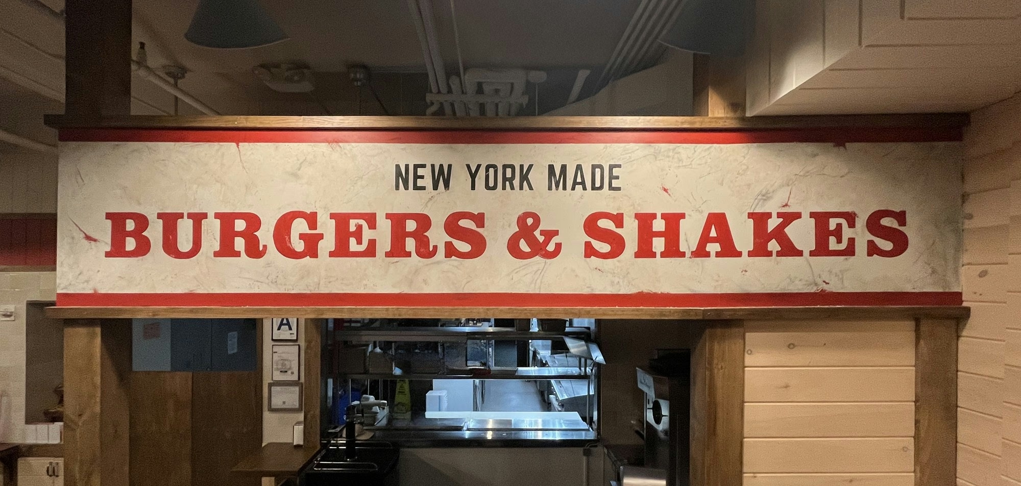
Brand identity in the built environment
Material selection, bar-area design, murals, and signage brought the visual identity into the physical space. I coordinated aspects of the design during construction; the Chelsea Market team finalized the interior.

02 / Creamline
Typography, illustration, and character
Developed with the owner, the identity combines expressive typography with a supporting illustration language. The logo, seal, and graphic elements connect the restaurant’s printed materials with its environmental graphics.


03 / Creamline
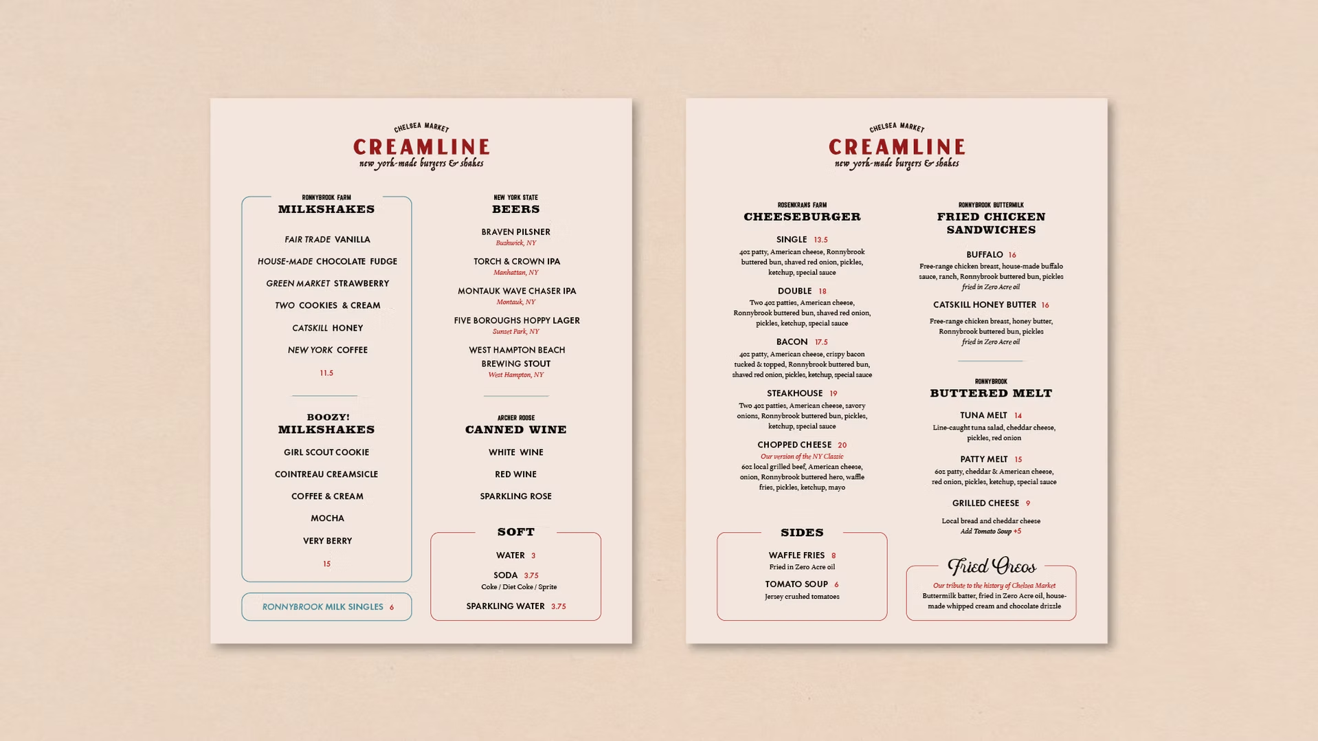
Menus and wayfinding
Printed menus, wall menus, and signage apply the same visual language to information customers use throughout their visit. Illustration and typographic hierarchy organize the content while maintaining the character of the brand.